Chapter 9: CSS and the Fluid Canvas
How the web's fluid nature differs from fixed canvases, and why that's a strength

Dania Rifki
As an artist, you're used to working on a fixed canvas. A sheet of watercolor paper is 22 x 30 inches. A digital canvas in Procreate can be 4096 × 4096 pixels. You control every millimeter, every pixel. Nothing moves unless you move it.
The web is not like that.
A website might be viewed on a phone held in portrait, a widescreen monitor, a tablet in landscape, a screen reader that doesn't "see" anything at all, or a browser window that someone has resized to half their screen while they watch a video on the other half. You don't know the dimensions. You don't know the device. You don't even know if the person can see.
This might feel like losing control. It's actually the opposite.
Content is like water
There's an illustration by Stéphanie Walter (originally based on a quote adapted by Josh Clark from Bruce Lee): "You put water into a cup, it becomes the cup. You put water into a bottle, it becomes the bottle. You put it in a teapot, it becomes the teapot."
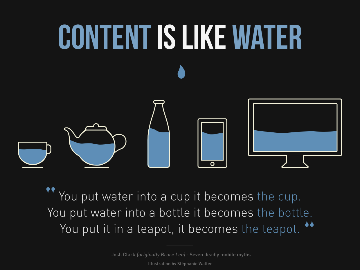
This is how content on the web works. Your text, your images, your layout: they flow into whatever container they find themselves in. A paragraph doesn't have a fixed width. It fills the space available to it. An image can shrink or grow. A grid of artwork can show four columns or two columns or one, depending on how much room there is.
The old approach to web design fought against this. Designers would pick three or four screen sizes (phone, tablet, desktop) and build a separate layout for each, snapping between them at fixed breakpoints. This meant you were really designing three separate fixed-canvas layouts and stitching them together.
The modern approach embraces the fluid nature of the web. Instead of designing for specific sizes, you establish relationships and proportions, then let the browser figure out the details. Your font sizes scale smoothly between a minimum and maximum. Your spacing breathes. Your layouts reflow when they need to, based on their content and available space, not because a breakpoint told them to.
Be the browser's mentor, not its micromanager
This phrase comes from Andy Bell, and it captures the philosophy perfectly. The browser is incredibly good at layout. It has been solving text-reflow and content-fitting problems for decades. When you write rigid, pixel-perfect CSS, you're overriding that intelligence. When you write flexible, hint-based CSS, you're collaborating with it.
Think of it this way: you're not painting the final piece. You're setting up a system of rules, proportions, and relationships. The browser then renders the final piece, differently for every person, but always following your system.
This is a different kind of creative control. Not less control. Different control. And for many artists, once the shift clicks, it actually feels more natural than the fixed-canvas approach. You're designing a system, not a snapshot.
There is no "correct" size
One more mental shift before we start writing CSS: there is no best way to view your website. Your site on a phone is not a compromised version of the "real" site on a desktop. Both are equally valid. Every size, every device, every context is a first-class experience.
If you'd like to explore this philosophy more deeply, Jeremy Keith's free online book Resilient Web Design is a beautifully written history of these ideas. It's short, and it reframes how you think about the web as a medium. Andy Bell's Build Excellent Websites distills the practical principles into a concise reference.
Now let's learn the medium.